The Village SLC
A pediatric practice, off WordPress.com and onto thirteen routes of its own.
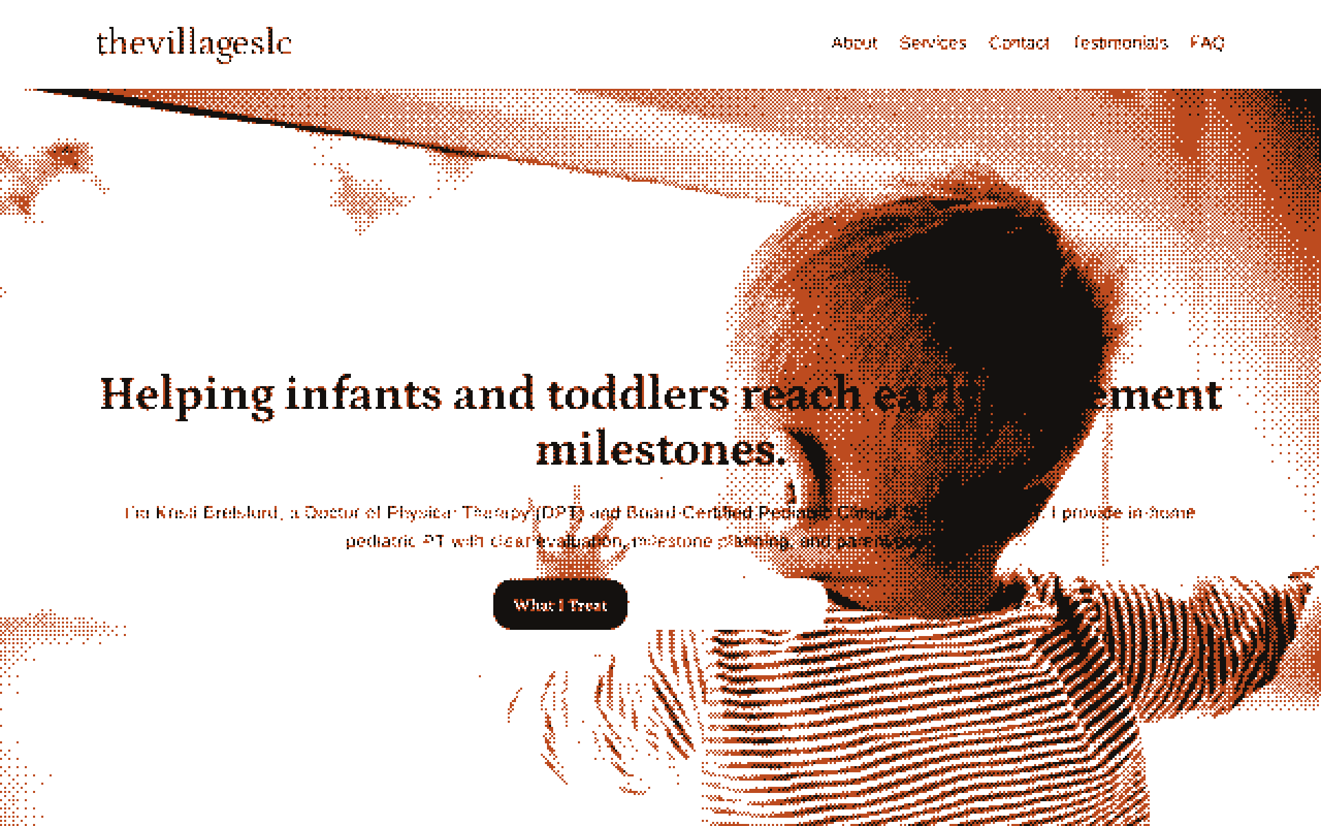
THE COVER · THE PRACTICE'S NAME, SET AS TYPE
SWITZER 900 · POSTERIZE 3 · BAYER 8 · VOID AND EMBER ON PAPER · 2026-08-26The Village SLC is a single-practitioner pediatric physical therapy practice: in-home work with children under five, across the Salt Lake Valley. It arrived on WordPress.com. What replaced it is a ground-up Next.js build — thirteen routes, a design system under all of them, the practice's own photography, a schema graph, and a 301 for every legacy URL.
The audience decided the design. A parent reading about a flat head or a missed milestone is worried, so the system reads editorial rather than medical: two faces and no third, a palette sampled from the practice's own brand rather than a rebrand, cream under sixty per cent of any viewport, and text only ever in ink.
Motion is held to the same reason. Photographs, cards and text never drift with scroll; only blurred colour fields do. The contact form is written and deliberately stubbed — hosting was the client's call, and until it is made nothing is sent and nothing is stored.
This is the first commission taken from outside the studio, and it ran the way the room says it runs: the structure settled in writing, then the design at every width, then the build, by the same pair of hands. What a website design and build includes →
- What was made
- The design system, thirteen routes, the build, the motion system, structured data, and the 301 map off WordPress
- Built with
- Next.js · React · TypeScript · Tailwind themed from CSS custom properties
- Type
- Petrona for display · Karla for everything else · no third face
- Colour
- Cream #F5F1E8 ground, sage surfaces, ink #2F3D33 text — sampled from the practice's own brand, governed 60/30/10
- Geometry
- Three radii — 12px fields, 24px cards, 999px pills — and one sanctioned exception, the arch-topped hero photograph
- Measured
- Lighthouse mobile, production build: 96 performance and 96 accessibility on the home page, 92 and 96 on a condition page. CLS 0 and TBT 0ms on both
- Year
- 2026
THE FINDINGS
Thirteen routes · one design system · judged at 1440×900 and 390×844Settled
How does a word rise out of an overflow mask without losing its descenders?
By reserving descender room inside the mask and cancelling it in the line box — 0.16em of padding against an equal negative margin. The hero sets its headline word by word, each one rising out of its own overflow box on a 65ms stagger, and a serif's g, p and y hang below the baseline the mask is cut at: they were being clipped. Padding the mask alone pushes the line down; padding it and subtracting the same amount back moves nothing, so the fix is invisible in every frame except the ones it repairs.
What keeps display type legible over a photograph nobody has chosen yet?
A scrim strengthened until it holds 3:1 over any crop of the picture, which this one did not — audited at 2.33:1 and fixed. The hero is a full-bleed photograph and the photograph is the client's to change, so the contrast cannot be a property of the image; it has to be a property of the layer over it, and the layer is what gets audited. The words carry a soft ink text-shadow as well, and that is belt and braces rather than the fix.
What should a nav do when the hero becomes a photograph?
Get quieter: a floating capsule at 25% cream over the picture, firming to 60% cream with a heavier blur and a faint ink shadow after 24px of scroll. The full-bleed hero and the quiet nav were one decision made in one commit. A header on a solid ground would have been a second object competing with the image, and a header with no ground at all disappears into it — what is wanted is presence at the weight the page can spare.
Where does reveal animation belong so that it can never hide content?
Behind an attribute JavaScript stamps on the root element, on a page that is actually visible, with a 3-second failsafe underneath it. Reveal styling that ships in the stylesheet hides content from a crawler, from a bundle that fails, and from anyone the script never reaches; gating it structurally means the readable page is the default and motion is what happens on top of it. The scroll library is dynamically imported only for visitors who have not asked for reduced motion — the rest never download it.
How do you swap photography without moving the page?
Make it a component contract instead of a habit, and the measured CLS is 0. One photo component and its placeholder twin impose a fixed aspect ratio with parent-driven width, so an image is never the thing that shifts — the box is decided by the layout and the photograph arrives into it. It holds for the blog's cover blocks too, which are visibly awaiting photography and are already reserving exactly the space those photographs will land in.

THE SAME PAGE · 390×844
PRODUCTION BUILD, HEADLESS CAPTURE · 2026-08-24
THE FOOT OF EVERY PAGE · SITE BY KILN
THE SAME BUILD, WITH THE CREDIT IN IT · 2026-08-24THE ASK
Taking work now.
Say what needs making. Answered personally, within a day.